Helen Frederick
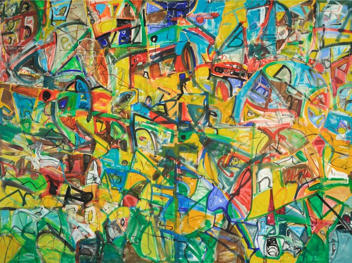
Colors 10, Acrylic on canvas, 2014
Colors: Decoding the Paintings of Michael Gross
Engaging with the new paintings of Michael Gross is like walking into a wild jungle that is open, vibrant, physically and emotionally demanding, heated with colorful movement, and suspended in orderly chaos. It is unexpected and untenable at first. After some moments of enjoyable vertigo, you settle down into careful observations with enriching recognition. The combination of bold colors, active shapes, and line work that is constantly shifting is not at all random, but possesses a balance of development and discovery. Over what seems to be acres of canvas, somewhat like a wild unknown field situated ahead of you, at midday in the brilliant sun, a view opens up.
The paintings give voice to a succulent air—a visual and musical arrangement. The thought of decoding each one after some hours of viewing them in chronological order is welcoming, but really these canvases are an all-together conversation. Capturing their joyful chaotic data will not come from cognitive reasoning. It will come from the pure pleasure of visual perception and understanding each of their particular parameters in unison. The physical action in these works is not only impressive, but groundbreaking, in relation to the last works exhibited in Gross’s exhibition titled Mono/Chromatics at the Edison Place Gallery in Washington, DC, in 2009.
Gross loves the challenge and discipline of this work. He wants to achieve orderly use of color, and although a few of the paintings were made spontaneously in short eruptions by the artist, many were not, therefore the viewer needs more time—in fact a long duration of time—to “survey” their surfaces and fully comprehend their visual impact.
The paintings continue Gross’s path of non-objective works, breaking down the boundaries of the canvas edges themselves and stepping into some new fields for visual thinking. They abound with moments of painterly inspiration and erstwhile bits of “messiness,” a rather new adaptation for the artist.
I have often been reminded of Arshile Gorky’s exuberant gestural paintings in relation to Gross’s paintings. The unloosened energies like Gorky’s How My Mother’s Embroidered Apron Unfolds in my Life (1944), illustrates thinly painted surfaces that fit into a model of abstraction. This model was found as much as it was invented. Recent histories of art suggest distinct critical models—for example: formalism, structuralism semiotics, abstraction, psychoanalysis, social art history, etc.—in which methods become significant to interpret works of art. Within Gross’s approaches, however, live the experience of his own artist mother, his mentor and close friend William Christenberry, and his exposure to art in Chicago from a very early age. Ultimately, the agency in Gross’s paintings has emerged inherently more from the grounds of literary theorist Roland Barthes, which supports the “general science of signs.” Barthes’s axioms recognize that signs are organized in opposites that shape their significance. Human activity partakes of at least one system of signs and generally several at once. These axioms surely thrive in Gross’s work, studio practice and his extraordinary paintings of the last three years.
Specifically in Colors #10 (2013), even though greens predominate, something like a shadow seems to be flying over the topography of loosely knit marks. A kind of haze or film of some muted grays is broken up in places with orange and yellow formations. The space moves in circles rather than imploding over the edges. In response to the width of the brushwork and amount of paint washed over the turbulent surfaces, the central section of the painting essentially holds a calligraphic pattern to stabilize the movement. The painting steps away from a square often employed in previous canvases, and a new larger and more horizontal format relays tightly fitted spaces, and even these will grow to disappear in the 2014 canvases. In this canvas there is equality of paint in the corners, and an assured awareness of new spatial unity in the center of the work. As we will see, the corners and edges (when there are multiple canvases) are becoming new magnetic fields in many works in the exhibition.
In 2014 Gross felt the need to use new tools. This is reflected in Colors #6 (2014), where Gross is much less linear in his brushwork that masterfully delineates shapes and corners. This canvas conveys a vitally open and activated metropolis of activity. Ultimately the ultramarine brushwork unifies the structure, while allowing a breakthrough in all the yellow playing fields sliced with orange, red, and green. This is such a lyrical painting, without knots, and very decided. It feels like an open window let air escape over the surface of the canvas. The work is boundless and peaceful compared to others. Gross confides it was two days in the making. A messy upper corner in the left diptych is fairly unlike Gross. In conversation, the artist mentions that he thinks about the enigmatic order in works by de Kooning, Pollock, and Mitchell. These works are surely juicy like Joan Mitchell but the colors are not “sweetened” by white pigment. They insist to be squeezed directly from a sun-driven coloration—wet, dry, intense, acidy, and utterly fresh.
Joining two different sized canvases side by side, and pressing the cool colors to overtake the warm colors, is the creative force of Colors #8 (2014) . Gross particularly likes this painting, and feels it relates to prints he made in the past. It is a painting using layered sequences similar to the way the artist navigates geometric stencils through a printing press. Violet, not seen in other works in the show, is highly useful in these paired canvases that bear a tremendously complex assembly of gestures and dense spatial concepts. A viewer feels that he/she is in the midst of a mad stained glass designer—one who fully knows the use of color and leaded line work, but who has taken a step further into a visually riskier area to bridge the disparity of the canvas size and bring them into a unified whole.
Pausing from the paintings for a moment and viewing the prints included in the exhibition, we experience Gross’s building blocks of photo-based imagery, letterforms, and carefully layered colors that are truly like stained glass figuration, as in Monoprint #5 (2013), cemented together with white edged lines. These prints provide a narrative of a different sort. Colors are flatter, blacks and pure primary colors are more predominant in uniting tumbling configurations. The panoply is more analytical and possibly more predetermined. Time slows down for us to identify physical places—a house in the snow, a path, ink drawings of beloved walks. The intimacy of the prints in part comes from scale, but also the pure joy of a stencil in a visual field—what an edited amount of information gives us to wonder about. As a series, the prints explore how Gross can handle sketch to suspension in ink as well as paint. These essentially printed paintings—typically characterized as pretty spontaneous—provide variations on themes Gross has been pondering over and over again. The textures and shapes also serve as conduits, allowing us to realize just how much ink makes Gross’s choice of spatial configuration work under the pressure of a press rather than the gesture of his brush.
Returning to the canvases, Colors #9 (2014) goes back to the comfortable level of a horizontal experience of spaces within the two paneled canvases. Like Monet’s Water Lilies, this panoramic view demands the viewer’s distance to appreciate the way a watery painted surface becomes an aerial topography of spider webs, trails, and small marks that affect the entire space. The right side of the image provides a boundary of a new sort, throwing us back to an enigmatic and precise vital blue shape in the center of the canvases. I keep thinking that if I viewed this painting in grayscale it would be an interesting experience as well, knowing that not only color, but also highly determined structure, maintains this artist’s approach.
Gross mentions that in Colors #10 he purposefully used different brushes and amounts of paints to provide different weighted lines. Comparing this canvas’s coverage to the others is interesting, as the whites here are additive, not the exposed original uncovered raw canvas surface. There are also overlays of various brownish colors and red dots amid typical Gross gestural strokes, but primarily midnight blue reigns here as the formal element to move our eye through space.
Colors #1 and #2 show Gross’s full power. It is truly as if the artist has blown away all his comfortable building blocks to give in to verticality and complex free fall. In Colors #1, made in two days, green swaths carry through all four canvases like a directional rain current. All other shapes pour down around this movement in perfect harmony, providing equilibrium.
Colors #2 is the driving masterful conclusion in the exhibition. Yellow is no longer the guiding abstracted force, as all the primaries sing together in this painting, and yellow has fallen back into a negative rather than positive space. It is as if one has stepped into a Zen garden gone beautifully crazy. All the pathways are there and the choices are many, with each shape fighting for the lead. The edges do provide boundaries here with vital red and orange contours, lines, and shapes. We feel that Gross has achieved his most complex abstraction in this work, and we are rewarded and so much better for it.